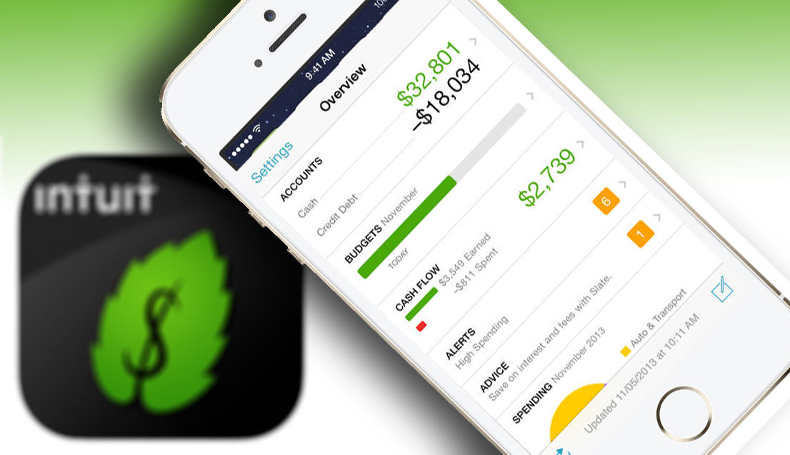
Mint, the best service in the world for managing your money, just got better with an iOS 7 update. Besides its newly designed icon and overall sprucing up of its design, Mint’s developers added new features to the free iOS app that let you use two of the browser-based Mint’s most powerful capabilities. Let’s take the updated Mint iOS app for a spin.
I’ve been using Mint for the past three years, and it’s come a long way. When I first started using the free browser-based Mint service in 2010, not all of my financial accounts were accessible. Now, Mint has done such a terrific job of wrangling banks, investment firms and credit card companies, all of my accounts’ data is automatically downloaded.
The two features I’ve found most useful on the browser-based Mint are the ability to plan ahead and spot trends in my spending and earnings — capabilities that are a crucial part of responsible financial planning. This new version 2.7.0 of Mint aims to enhance both of those areas on the iOS platform.
Let’s start with the ability to edit pending transactions. On Mint’s iTunes page, that’s listed as one of the new features, but it stops far short of what I’d like to see. The key word is “edit,” because the application won’t let you add pending transactions, or even change the amount of those transactions you’ve already entered. All it will do is let you change the date when that transaction will happen. It’s of limited usefulness. If you want to add a new transaction, you’ll have to do that in the browser-based version of Mint.
It would be helpful to be able to add and completely modify pending transactions on Mint’s iOS app. It’s important because the ability to anticipate what you’re going to be spending and earning — and have that added up for you by Mint — can help you keep from being gouged by those outrageous fees that hit you when you overdraw your checking account.
How hard could it have been to let users add pending transactions in the iOS app? I’m hoping we’ll see that in a future update, because this halfhearted attempt is just a tease.

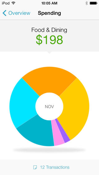
A far more useful update in this new version is the ability to spot trends. Like the browser version, you’re presented with a pie chart of your overall spending, with each category represented as pieces of the pie. You can spin the chart around to see which category each of the pieces represents, along with its current amount. I especially like the way you can scroll down from that graphic and get a more detailed view of all of the transactions incorporated within.
Aside from those two new features, the iOS redesign its simple and pleasing, and I think it’s a definite improvement over the previous version. Perhaps those missing capabilities I mentioned above were left out in the interest of keeping Mint extremely easy to use. Beyond that, I’m thinking the developers determined that financial forecasting is not something you’ll really want to do so much on your iPhone, instead leaving those tasks for your desktop, using a browser.
Overall, this free upgrade adds more power to a service that I admire and depend on. It stops short of everything I’d like for it to do, but maybe for that wish list all have to wait for version 3.0.
As an aside, my financial advisor is also highly impressed with Mint. When I met with her just yesterday, she emphasized to me that one of the best ways to get a handle on your spending is to observe its effects in near-real time. That’s precisely what Mint does, and this new version of its iOS app makes that potentially cumbersome task even easier.
Images: Apple, iTunes/Mint; composite by Charlie White
